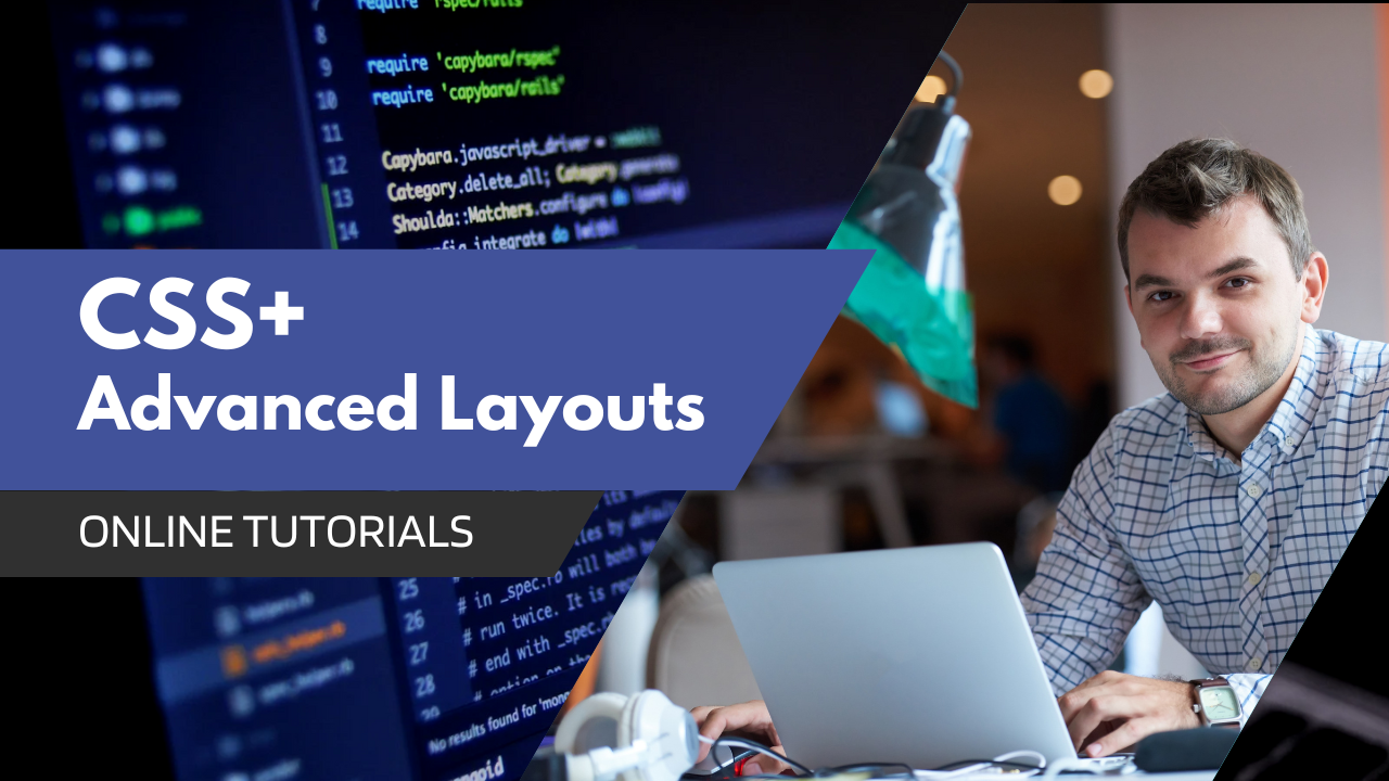
CSS Layouts are essential for creating modern, user-friendly websites. This advanced course dives deep into CSS Flexbox and CSS Grid, two powerful tools that revolutionize web layout design. You’ll learn how to build responsive and flexible layouts that adapt seamlessly to different screen sizes and devices. From aligning items in rows or columns to creating complex grid systems, this course will give you the expertise to create professional, dynamic web designs. By the end of the course, you’ll be able to create advanced layouts, build fluid responsive websites, and understand the best practices for modern web development.
Course Content
Introduction to Advanced Layout Techniques
Overview of Flexbox, CSS Grid, and responsive design principles.
Understanding Flexbox Basics
Learn how to use Flexbox to create flexible and dynamic layouts.
Flexbox Advanced Concepts
Explore advanced techniques like aligning, justifying, and creating complex layouts.
CSS Grid Basics
Introduction to CSS Grid and creating basic grid layouts.
Advanced CSS Grid Layouts
Build multi-column, multi-row grid systems and manage grid areas.
Flexbox: A Responsive Layout Tool
Create flexible layouts using Flexbox for mobile-first web design.
CSS Grid: Layouts Made Easy
Learn how to create grid-based layouts for complex, responsive designs.
Responsive Design with Media Queries
Make your website mobile-friendly by adjusting styles based on screen size.
Creating Complex Layouts with Flexbox & Grid
Master complex layouts using both Flexbox and Grid together.
Advanced CSS Techniques
Explore more advanced styling techniques such as custom properties and pseudo-elements.
Real-World Project: Building a Responsive Website
Apply Flexbox and CSS Grid to create a real-world responsive web page.
Requirements
Basic knowledge of HTML and CSS (preferably after completing Course 1 and 2).
A computer with internet access.
Code editor: Visual Studio Code (free and recommended).
No prior experience with Flexbox or Grid required, but familiarity with CSS layout basics is recommended.
What you'll learn
Master modern layout tools: Become proficient in Flexbox and CSS Grid for designing professional layouts.
Build fully responsive websites: Create websites that look great on any device, from desktops to mobiles.
Handle complex layouts with ease: Build sophisticated designs like multi-column layouts, card grids, and more.
Prepare for real-world projects: Learn industry-standard techniques that are essential for web development.
Create websites that adapt to user needs: Learn mobile-first design and make your websites usable across all screen sizes.
Enhance your design skills: Gain the confidence to implement modern web design practices in your projects.